Grid plugins#
For details on how grids work, see, e.g. the Bootstrap 5 documentation.
Container#
A container is an invisible element that wraps other content. There are in two types of containers:
- Container
All other containers restrict the width of their content depending on the used device.
- Fluid container
A fluid container occupies the full width available - no matter how wide the viewport (or containing) element is.
- Full container
A full container is like a fluid container and occupies the full width available. Additionally, it does not have a padding. Its content can therefore fill the entire area. Full containers are useful if you want to add a background color or shadow to another DOM element, like, e.g., the contents of a column.
Note
- New feature:
Containers can have a background color (“context”), opacity and shadow.
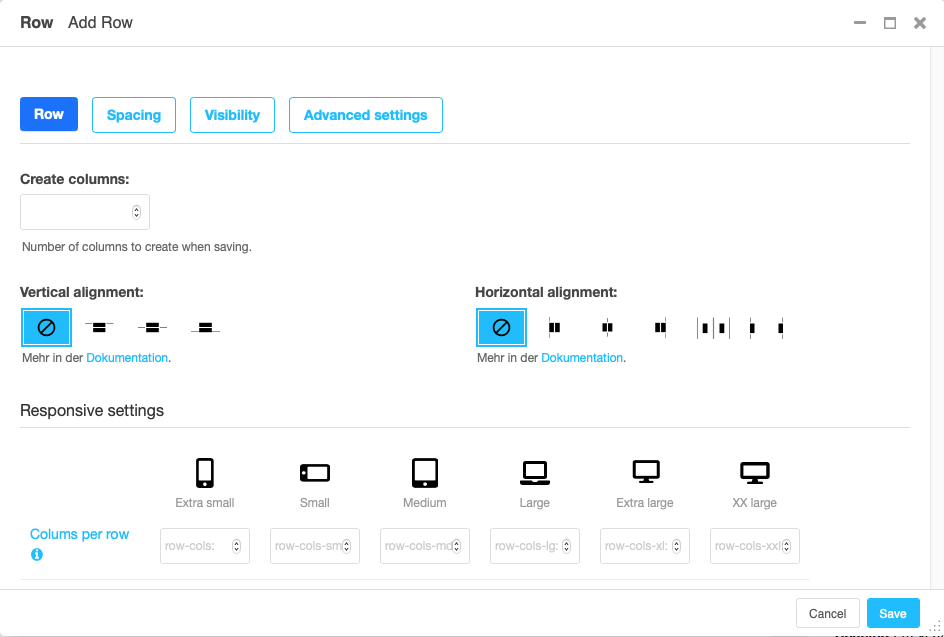
Row#
A row contains one or more columns. By default columns are displayed next to each other.
To automatically create not only a row but also some columns within that row, enter the number of columns you will be using. You can always later add more columns to the row or delete columns from the row.
Vertical aligned defines how columns of different height are positioned against each other.
Horizontal alignment defines how columns that do not fill an entire row are distributed horizontally.
Note
New feature:
The section “Row-cols settings” defines how many columns should be next to each other for a given display size. The “row-cols” entry defines the number of columns on mobile devices (and above if no other setting is given), the “row-cols-xl” entry the number of columns on a xl screen.
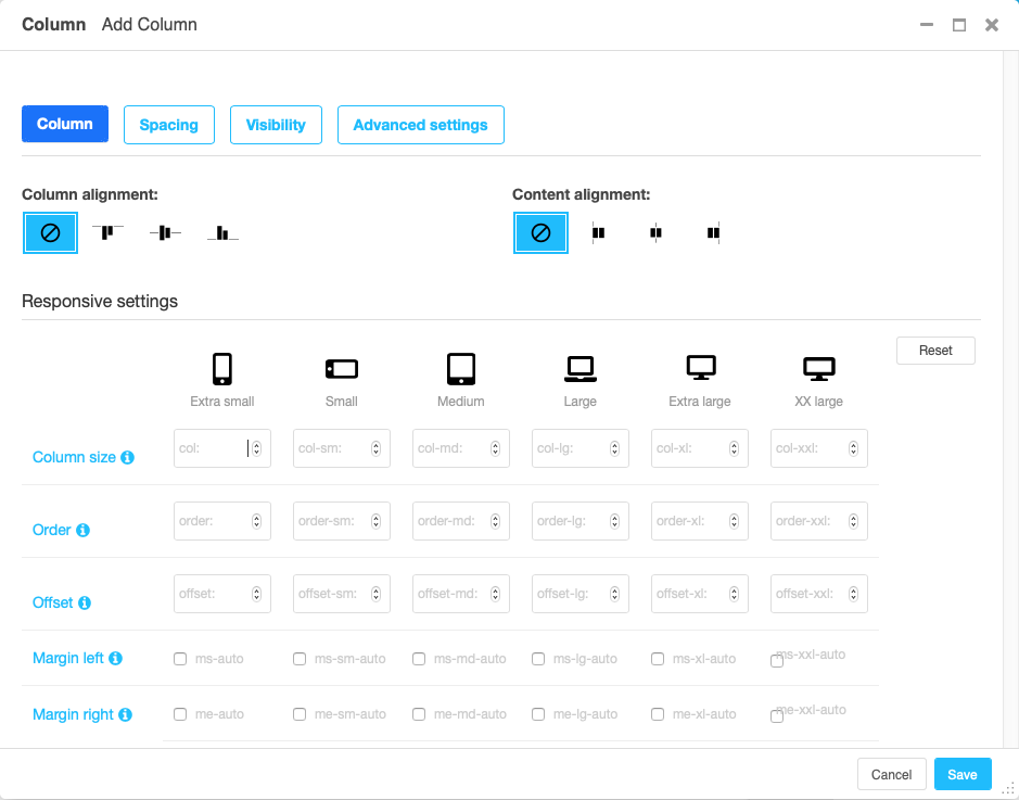
Column#
The column settings is largely about how much of the grid space the column will use horizontally. To this end, the grid is divided in (usually) 12 strips of equal width.
- Auto sizing
If no information on the column size is given, the column will be autosizing. This means that all autosizing columns of a row will occupy the same fraction of the space left, e.g. by sized columns.
- Specifically sized columns
If you enter a number the column for the specific screen size will exactly have the specified width. The unit of width is one twelfth of the surrounding’s row width.
- Natural width:
If you need a column to take its natural width, enter
0for its column size. This will displayautofor columns size.
Also, you can adjust the vertical alignment of the specific column from the row’s default setting.
Finally, you can set the alignment of the content to left (right in a rtl environment), center or right (left in a rtl environment). This comes handy if, e.g., the column is supposed to contain centered content.
Note
- Removed:
The column type entry has been removed since it was a legacy from Bootstrap version 3.