Pre-built component plugins
djangocms-frontend adds a set of plugins to Django-CMS to allow for
quick usage of components defined by the underlying css framework, e.g.
Bootstrap 5.
While djangocms-frontend is set up to become framework agnostic, its
heritage from djangocms-bootstrap4 is intentional and quite visible.
Hence for the time being, this documentation references the Bootstrap 5
documentation.
Note
Custom components can easily be added using Building Custom Components With Form Classes.
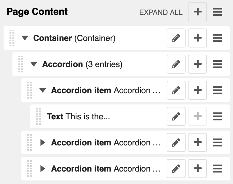
Accordion component
Build vertically collapsing sections using accordions:
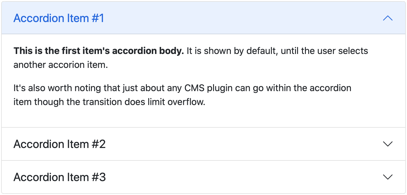
Accordions consist of an Accordion plugin which has an Accordion Item plugin for each collapsable section.
Also see Bootstrap 5 Accordion documentation.
Re-usable component example
The accordion component is a good example of a re-usable component. It can be used in all your project’s templates. Here is an example of how to create an accordion (if key word arguments are skipped they fall back to their defaults):
{% load frontend %}
{% plugin "accordion" accordion_header_type="h2" accordion_flush=False %}
    {% plugin "accordionitem" accordion_item_header="Accordion item 1" accordion_item_open=True %}
        Content of accordion item 1
    {% endplugin %}
    {% plugin "accordionitem" accordion_item_header="Accordion item 2" %}
        Content of accordion item 1
    {% endplugin %}
{% endplugin %}
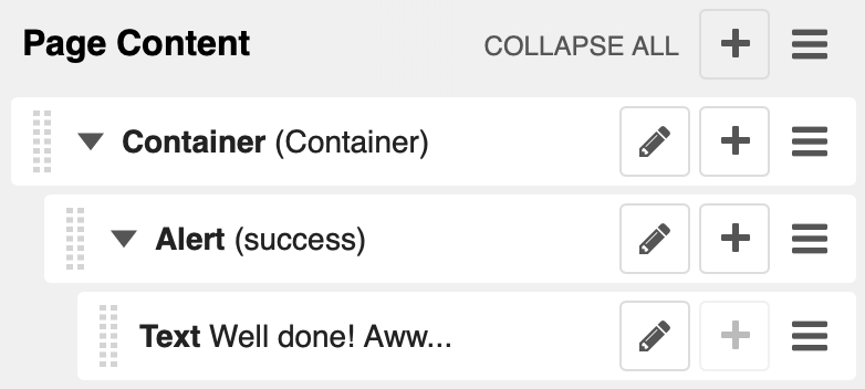
Alert component
Alerts provide contextual feedback messages for typical user actions with a handful of available alert messages.
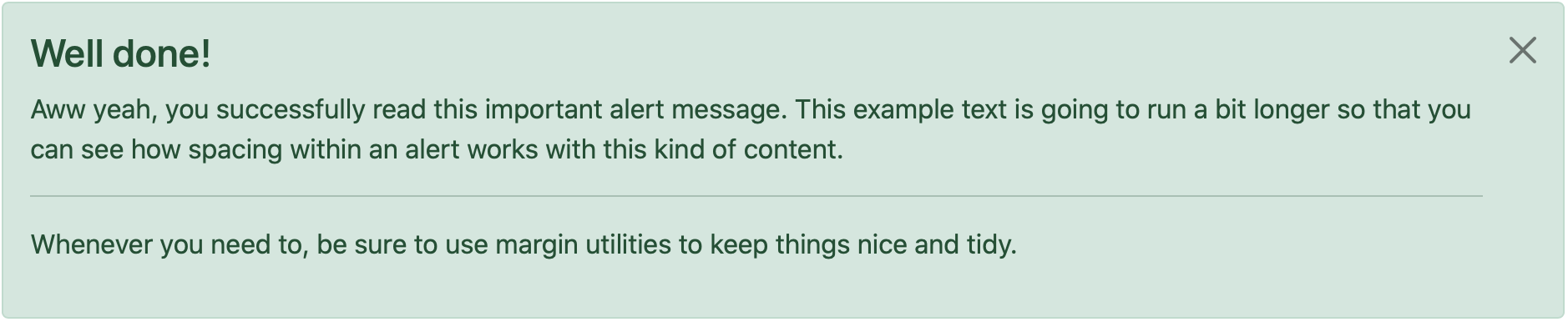
Alerts can be marked dismissible which implies that a close button is added on the right hand side.
Note
- New features:
Alerts can have shadows to optically lift them.
Also see Bootstrap 5 Alerts documentation.
Re-usable component example
djangocms-frontend plugins can be used as components. They can be
used in all your project’s templates. Example (if key word arguments are
skipped they fall back to their defaults):
{% load frontend %}
{% plugin "alert" alert_context="primary" alert_dismissible=True %}
    Alert text goes here!
{% endplugin %}
Badge component
Badges are small count and labeling components usually in headers and buttons.
While often useful if populated automatically as opposed to statically in a plugin, badges are useful, e.g., to mark featured or new headers.
Also see Bootstrap 5 Badge documentation.
Re-usable component example
djangocms-frontend plugins can be used as components. They can be
used in all your project’s templates. Example (if key word arguments are
skipped they fall back to their defaults):
{% load frontend %}
{% plugin "badge" badge_text="My badge" badge_context="info" badge_pills=False %}
    This content is ignored.
{% endplugin %}
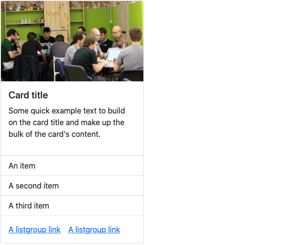
Card component
A card is a flexible and extensible content container. It includes options for headers and footers, a wide variety of content, contextual background colors, and powerful display options.
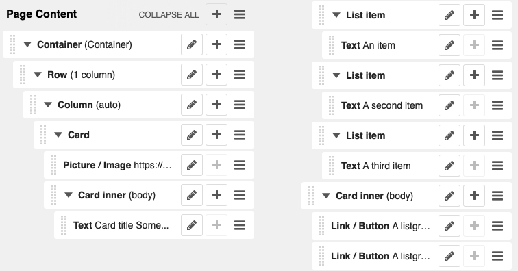
A card consists of the card wrapper itself, the Card Plugin. It can contain one ore more instances of a Card Inner Plugin for header, body or footer, but also potentially an Image Plugin for the card image or list group components.
The corresponding plugin tree is here:
Cards can be grouped by a Card Layout component offering the ability group cards or display a grid of cards. The latter can be controlled by responsive tools. If you need more granular responsive settings, please revert to Grid plugins and build your own custom grid.
Warning
djangocms-bootstrap4 Card Decks are not supported by Bootstrap 5. Card decks will be converted to grids of cards upon Migrating from djangocms-bootstrap4.
Card
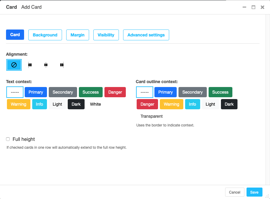
The card resides in a Card plugin which allows for coloring, opacity and shadow options.
Content is added to the card plugin by creating child plugins. These can be of the type Card inner, Picture / Image, List group, or Row.
Note
- New feature:
By adding images or list groups directly to a card, unnecessary margins are avoided.
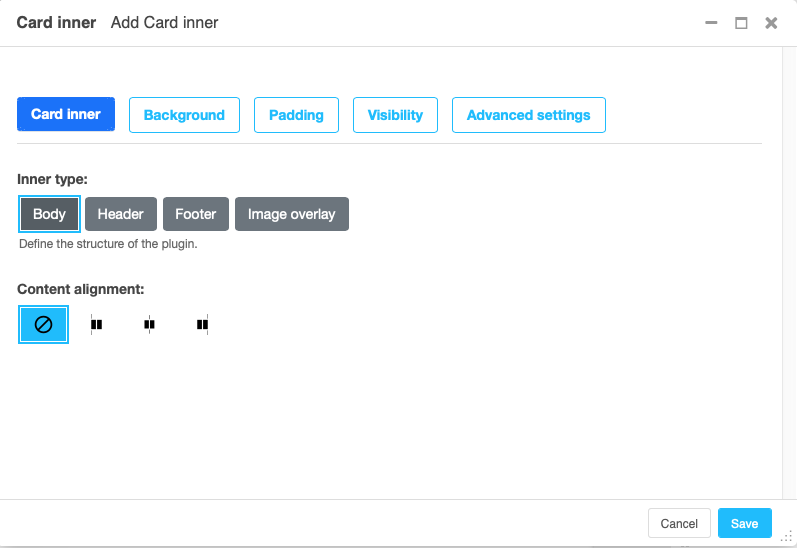
Card inner
The Card Inner plugin allows to add the card header, body, footer or an overlay space for a card image.
Here is an example of the new card Image overlay feature:

Also see Bootstrap 5 Card documentation.
Re-usable component example
djangocms-frontend plugins can be used as components. They can be
used in all your project’s templates. Example (if key word arguments are
skipped they fall back to their defaults):
{% load frontend %}
{% plugin "card" card_alignment="center" card_outline="info" card_text_color="primary" card_full_height=True %}
    {% plugin "cardinner" inner_type="card-header" text_alignment="start" %}
        <h4>Card title</h4>
    {% endplugin %}
    {% plugin "cardinner" inner_type="card-body" text_alignment="center" %}
        Some quick example text to build on the card title and make up the
        bulk of the card's content.
    {% endplugin %}
    {% plugin "listgroupitem" %}An item{% endplugin %}
    {% plugin "listgroupitem" %}A second item{% endplugin %}
    {% plugin "listgroupitem" %}A third item{% endplugin %}
{% endplugin %}
Carousel component
A Carousel is a set of images (potentially with some description) that slide in (or fade in) one after the other after a certain amount of time.
Each slide requires a Carousel Slide child plugin. The simplest case specifies an image, potentially a caption and a link which is followed once the slide is clicked.
Since the design of carousels is somewhat opinionated template sets can be
specified using the DJANGOCMS_FRONTEND_CAROUSEL_TEMPLATES setting.
Note
A Carousel Slide plugin can have child plugins itself. If an image is specified the child plugins add to the caption. If no image is specified the child plugins make up the slide.
Re-usable component example
djangocms-frontend plugins can be used as components. They can be
used in all your project’s templates. Example (if key word arguments are
skipped they fall back to their defaults):
Note
Carousel slides read settings from their parent carousel while rendering,
so a carousel has to be built inside django CMS. Unlike the other
components, it cannot be rendered standalone with the {% plugin %} tag.
{% load frontend %}
{% plugin "carousel" template="my_template" carousel_controls=True %}
    {% plugin "carouselslide" %}
        <h4>Carousel slide title</h4>
        <p> Some more content...</p>
    {% endplugin %}
    {% plugin "carouselslide" %}
        <h4>Carousel slide title</h4>
        <p> Some more content...</p>
    {% endplugin %}
{% endplugin %}
Parameters for {% plugin "carousel" %} are:
template: The template to use for the carousel. If not specified the default template is used.carousel_controls: If set toTruethe carousel will have controls.carousel_indicators: If set toTruethe carousel will have indicators.carousel_interval: The interval in milliseconds between slides. If not specified the default interval (5000) is used.carousel_pause: If set tohoverthe carousel will pause on hover.carousel_wrap: If set toTruethe carousel will wrap around.carousel_keyboard: If set toTruethe carousel will react to keyboard events.carousel_ride: If set toTruethe carousel will start sliding automatically.carousel_aspect_ratio: The aspect ratio of the carousel. If not specified the default aspect ratio (16:9) is used.
Parameters for {% plugin "carouselslide" %} are:
carousel_image: The image to display in the slide. If not specified the slide will be empty.carousel_content: The HTML caption to display in the slide.
Collapse component
The Collapse hides text behind its headline and offers the user a trigger (e.g., a button) to reveal itself.
Compared to the accordion component the collapse component often is more flexible but also requires more detailed styling.
A collapse consists of a Collapse plugin wrapping a Collapse Trigger plugin (the element that toggles the content) and a Collapse Container plugin (the content that is shown or hidden). The trigger and the container are connected by giving them the same identifier.
Re-usable component example
djangocms-frontend plugins can be used as components. They can be
used in all your project’s templates. Example (if key word arguments are
skipped they fall back to their defaults):
{% load frontend %}
{% plugin "collapse" %}
    {% plugin "collapsetrigger" trigger_identifier="example" %}
        <button class="btn btn-primary" type="button">Toggle</button>
    {% endplugin %}
    {% plugin "collapsecontainer" container_identifier="example" %}
        <p>This content is revealed and hidden by the trigger.</p>
    {% endplugin %}
{% endplugin %}
Parameters for {% plugin "collapse" %} are:
collapse_siblings: CSS selector used to group collapses into an accordion. Default is".card".
Parameters for {% plugin "collapsetrigger" %} are:
trigger_identifier: Connects the trigger to the container that carries the same identifier. Required.
Parameters for {% plugin "collapsecontainer" %} are:
container_identifier: Connects the container to the trigger that carries the same identifier. Required.
Jumbotron component
The jumbotron component is a large header, used e.g. as a page header. It has been part of Bootstrap 4 and is still supported as a convenient way to generate page headers.
Note
The jumbotron header is not reflected by the table of contents component.
Re-usable component example
djangocms-frontend plugins can be used as components. They can be
used in all your project’s templates. Example (if key word arguments are
skipped they fall back to their defaults):
{% load frontend %}
{% plugin "jumbotron" jumbotron_fluid=False %}
    <h1>Hello, world!</h1>
    <p>A large header to showcase the most important content.</p>
{% endplugin %}
Parameters for {% plugin "jumbotron" %} are:
template: The template to use for the jumbotron. If not specified the default template is used.jumbotron_fluid: If set toTruethe jumbotron fills the full width of its container. Default isFalse.
List group component
List groups are a flexible and powerful component for displaying a series of content. Modify and extend them to support just about any content within.
The component consists of a wrapper - ListGroup Plugin - and the items of the list - ListGroupItem Plugin. If the list item is a link it suffices to insert a Link Plugin directly as a child of the ListGroup Plugin.
List group
The only setting is the list group flush setting. If checked, the list group will be rendered without borders to blend into the surrounding element, e.g. a card.
List group item
Simple content can be specified by providing “One line content”. More complex content of a list group item is rendered by child plugins. If child plugins are available the “one line content” is ignored.
List group items can have a context (color), and three state: Regular, active and disabled.
Note
- New feature:
Links can be added to list groups and automatically are interpreted as list group items.
Re-usable component example
djangocms-frontend plugins can be used as components. They can be
used in all your project’s templates. Example (if key word arguments are
skipped they fall back to their defaults):
{% load frontend %}
{% plugin "listgroup" list_group_flush=False %}
    {% plugin "listgroupitem" %}An item{% endplugin %}
    {% plugin "listgroupitem" list_context="primary" %}A second item{% endplugin %}
    {% plugin "listgroupitem" list_state="active" %}An active item{% endplugin %}
{% endplugin %}
Parameters for {% plugin "listgroup" %} are:
list_group_flush: If set toTruethe list group is rendered without borders to blend into a surrounding element. Default isFalse.
Parameters for {% plugin "listgroupitem" %} are:
simple_content: One-line content of the item. Ignored if the item has child plugins.list_context: Contextual color of the item, e.g.primary.list_state: State of the item, eitheractiveordisabled.
Media component
The media component is another legacy component from djangocms-bootstrap4.
djangocms-frontend recreates it using responsive utilities.
A media object consists of a Media plugin which typically contains a media element (e.g. a Picture / Image plugin) next to a Media Body plugin holding the accompanying text.
Re-usable component example
djangocms-frontend plugins can be used as components. They can be
used in all your project’s templates. Neither the Media nor the Media Body
plugin take component-specific parameters:
{% load frontend %}
{% plugin "media" %}
    {% plugin "mediabody" %}
        <h5>Media heading</h5>
        <p>Text shown next to the media element.</p>
    {% endplugin %}
{% endplugin %}
Picture / image component
The image or picture component make responsive picture uploads available as well as responsive embedding of external pictures.
Added in version 1.2: djangocms-text-ckeditor supports dragging and dropping images into a rich
text field. If you add the following line to your settings.py file,
djangocms-text-ckeditor will automatically convert an image dropped into it
to a djangocms-frontend image component.
TEXT_SAVE_IMAGE_FUNCTION = 'djangocms_frontend.contrib.image.image_save.create_image_plugin'
Please note, that images dropped into djangocms-text-ckeditor are base64- encoded and take a quite a bit of band width. You may have to increase your DATA_UPLOAD_MAX_MEMORY_SIZE setting in settings.py.
We recommend not using this feature but instead adding a image component through the “CMS Plugin” menu of Ckeditor.
Spacing component
The spacing component provides horizontal and/or vertical spacing. If used without child plugins it just provides the amount of space specified on the specified sides.
Note
If no spacing is selected the spacing component can be used to individually style the content using the attributes fields in “Advanced Settings”.
Re-usable component example
djangocms-frontend plugins can be used as components. They can be
used in all your project’s templates. Example (if key word arguments are
skipped they fall back to their defaults):
{% load frontend %}
{% plugin "spacing" space_property="m" space_sides="y" space_size="3" space_device="md" %}
    Content with vertical margins on medium screens and larger.
{% endplugin %}
Parameters for {% plugin "spacing" %} are:
space_property:mfor margin orpfor padding. Default ism.space_sides: Side(s) the spacing applies to:""(all),t(top),r(right),b(bottom),l(left),x(left and right) ory(top and bottom). Default is"".space_size: Amount of spacing from0to5orauto. Default is0.autois not available for padding.space_device: Device from which the spacing applies (and larger):""(all),xs,sm,md,lg,xlorxxl. Default is"".
Blockquote component
Creates a <blockquote> tag.
Note
- New feature:
Alternatively to the un-formatted quote text, child plugins can be used to fill the content of the blockquote.
Re-usable component example
djangocms-frontend plugins can be used as components. They can be
used in all your project’s templates. Example (if key word arguments are
skipped they fall back to their defaults):
{% load frontend %}
{% plugin "blockquote" quote_content="A well-known quotation." quote_origin="Famous Author" quote_alignment="center" %}{% endplugin %}
Parameters for {% plugin "blockquote" %} are:
quote_content: The quotation text. Required (unless child plugins are used).quote_origin: The source or author of the quotation.quote_alignment: Alignment of the quote:"",start,centerorend.
Code component
Have code snippets on your site using this plugin, either inline or as a code block.
djangocms-frontend offers the ace code editor
to enter code bits.
Warning
By default the ace code editor javascript code is retrieved over the internet
from a cdn. If you do not want this to happen, e.g., for data privacy reasons
or because your system is not connected to the internet, please use the
weak dependency on djangocms-static-ace
by changing your requirement from djangocms-frontend to
djangocms-frontend[static-ace] and include
"djangocms_static_ace" in your INSTALLED_APPS.
Re-usable component example
djangocms-frontend plugins can be used as components. They can be
used in all your project’s templates. Example (if key word arguments are
skipped they fall back to their defaults):
{% load frontend %}
{% plugin "code" code_type="pre" code_content="print('Hello, world!')" %}{% endplugin %}
Parameters for {% plugin "code" %} are:
code_content: The code snippet to display. Required.code_type: How the snippet is rendered:code(inline code),pre(code block),var(variables),kbd(user input) orsamp(sample output). Default iscode.
Figure component
The figure component supplies a wrapper and a caption for a figure. The figure itself is placed inside the figure component (as child plugins).
Re-usable component example
djangocms-frontend plugins can be used as components. They can be
used in all your project’s templates. Example (if key word arguments are
skipped they fall back to their defaults):
{% load frontend %}
{% plugin "figure" figure_caption="Figure 1: An example figure" figure_alignment="center" %}
    <img src="/static/example.jpg" alt="An example image">
{% endplugin %}
Parameters for {% plugin "figure" %} are:
figure_caption: The caption shown below the figure. Required.figure_alignment: Alignment of the figure:"",start,centerorend.
Tabs component
Tabs organize content into separate panes, only one of which is shown at a time. The component consists of a Tabs plugin which wraps one Tab Item plugin for each pane. The tab titles are generated from the Tab Item plugins and let the user switch between panes.
Also see Bootstrap 5 Navs & tabs documentation.
Note
Bootstrap 5 comes with a fade animation. Additional animations will have to
be provided by you or a third party. If you use a CSS animation library,
you can make these animations available by adjusting the
DJANGOCMS_FRONTEND_TAB_EFFECTS setting.
Re-usable component example
djangocms-frontend plugins can be used as components. They can be
used in all your project’s templates. Example (if key word arguments are
skipped they fall back to their defaults):
Note
Tab items read settings from their parent tab while rendering, so tabs have
to be built inside django CMS. Unlike the other components, they cannot be
rendered standalone with the {% plugin %} tag.
{% load frontend %}
{% plugin "tab" tab_type="nav-pills" tab_alignment="justify-content-center" %}
    {% plugin "tabitem" tab_title="Tab 1" tab_bordered=True %}
        <h4>Content of tab 1</h4>
        <p> Some content...</p>
    {% endplugin %}
    {% plugin "tabitem" tab_title="Tab 2" tab_bordered=True %}
        <h4>Content of tab 2</h4>
        <p> Some more content...</p>
    {% endplugin %}
{% endplugin %}
Parameters for {% plugin "tab" %} are:
template: The template to use for the tabs. If not specified the default template is used.tab_type: The type of the tabs. If not specified the default type is used.tab_alignment: The alignment of the tabs. If not specified the default alignment is used.tab_index: The index of the initially active tab. If not specified the first tab is active.tab_effect: The effect of the tabs."fade"is available. If not specified no effect is used.
Parameters for {% plugin "tabitem" %} are:
tab_title: The title of the tab.tab_bordered: If set toTruethe tab will have a border.
Icon component
Added in version 1.1.
djangocms-frontend’s icon plugin supports a variety of popular icon fonts. The icon component is centered around Gilles Migliori’s universal icon picker.
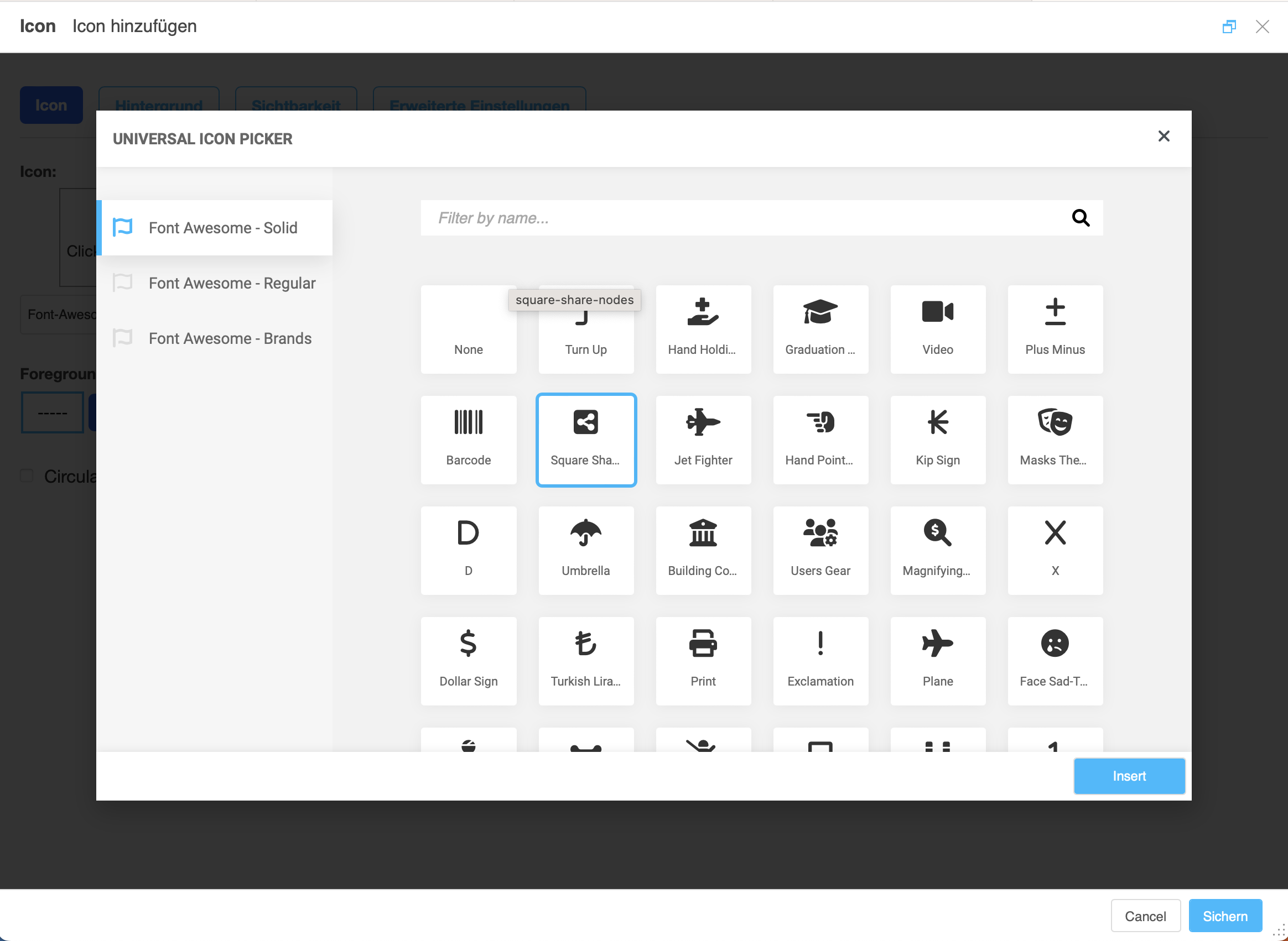
A version of it is bundled with djangocms-frontend. It currently contains
support for the following icon sets:
Elegant icons (bundled)
Feather icons (bundled)
Fomantic UI icons (bundled)
Foundation icons (bundled)
Erik Flowers’ Weather icons (bundled)
Note
The icon picker needs a config file for each icon set. This requires regular update. Please be patient if new icons do not appear immediately in djangocms-frontend’s icon picker or - even better - create a pull request!
Warning
You may either use djangocms-icon or djangocms-frontent’s icon contrib
package but not both, since they both register an IconPlugin.
Icon fonts
As marked in the overview above, some MIT licenced icon fonts are bundled for convenience. They are available to the web page through static files.
For other icon sets source files are loaded from CDN through the internet by
default. This is not necessarily a configuration you want to have in a production
situation. To specify where to get the required css files from please use the
DJANGOCMS_FRONTEND_ICON_LIBRARIES setting.
To just restrict the available choices of icon sets for the user use the
DJANGOCMS_FRONTEND_ICON_LIBRARIES_SHOWN setting.
Icons can be sized. Options for icon sizes are defined by the DJANGOCMS_FRONTEND_ICON_SIZE_CHOICES setting.
Adding custom icon fonts
To add a custom icon font you need to generate a config file. This is a json file that tells the icon picker which icons are available. As an example check out the config file for Bootstrap Icons:
{
    "prefix": "bi bi-",
    "icon-style": "bi",
    "list-icon": "bi bi-badge1",
    "icons": [
        "123",
        "alarm-fill",
        "alarm",
        "align-bottom",
        "align-center",
        "align-end",
        ...
   ]
}
Icons are rendered as <i> tags with classes.
.prefix defines a string that is prepended to all icons. For Bootstrap icons
that’s the class bi and the prefix for the icon selecting class bi-.
The list .icons contains all available icons in the set.
.list-icon contains the classes for the example icon. You can probably ignore it.
.icon-style currently is unused. It may in future determine how icons are
rendered. Currently all icons are rendered by <i class="bla"></i> except
material design icons which are rendered by <i class="material-icon">bla</i>.
Using svg sprites
Currently only font-based icons are supported.
Icon plugins inside text plugins
The icon plugin is text-enabled, i.e., you can add it to a text plugin through
djangocms-text-ckeditor’s CKEDITOR. By default, however, CKEDITOR removes empty
<span> or <i> tags which most icons use.
To disable this behavior of CKEDITOR, you need to add a customConfig entry
in CKEDITOR_SETTINGS, e.g.,
CKEDITOR_SETTINGS = {
    ...,
    "customConfig": "icon/ckeditor.icons.js",
    ...,
}
This will load the ckeditor.icons.js file which in turn will allow empty
span and i tags.
If you already have a customConfig file specified it will suffice to add
the following two lines to it.
CKEDITOR.dtd.$removeEmpty.span = 0;
CKEDITOR.dtd.$removeEmpty.i = 0;
Finally, you potentially need to add the necessary icon css files to the
contentCss property of CKEDITOR_SETTINGS, e.g., for bootstrap icons
from their cdn
CKEDITOR_SETTINGS = {
    ...,
    "contentsCss": [
        ...,
        "https://cdn.jsdelivr.net/npm/bootstrap-icons@1.10.3/font/bootstrap-icons.css",
        ...,
    ],
    ...,
}