Component plugins#
djangocms-frontend adds a set of plugins to Django-CMS to allow for
quick usage of components defined by the underlying css framework, e.g.
bootstrap 5.
While djangocoms-frontend is set up to become framework agnostic its
heritage from djangocms-bootstrap4 is intentionally and quite visible.
Hence for the time being, this documentation references the Bootstrap 5
documentation.
Accordion component#
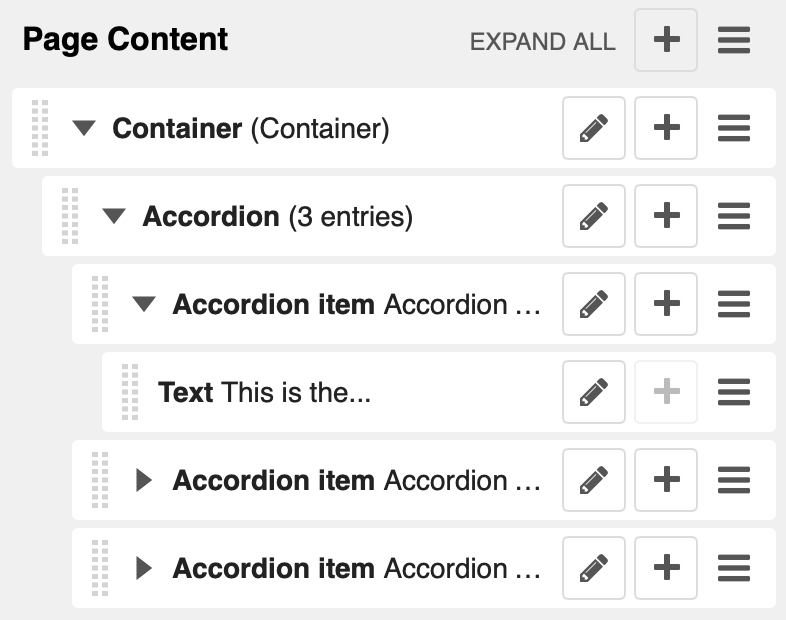
Build vertically collapsing sections using accordions:
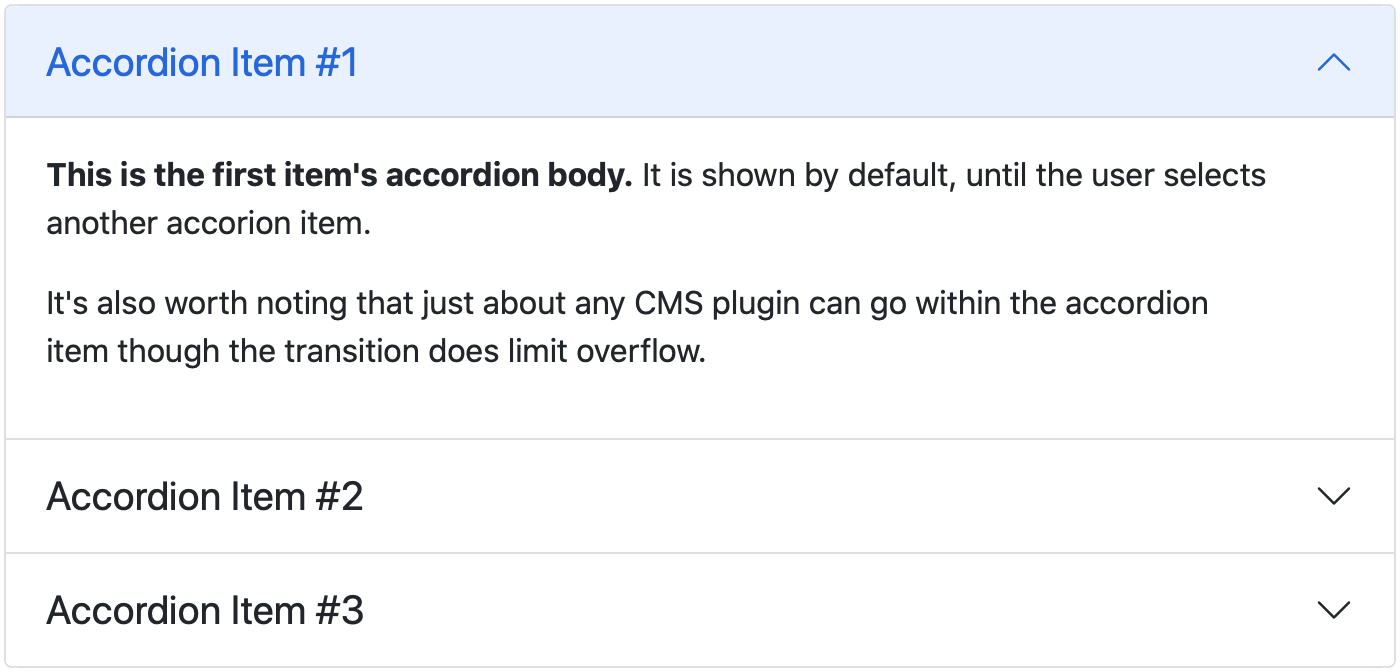
Accordions consist of an Accordion plugin which has an Accordion Item plugin for each collapsable section.
Also see Bootstrap 5 Accordion documentation.
Alert component#
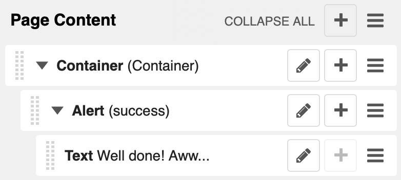
Alerts provide contextual feedback messages for typical user actions with a handful of available alert messages.
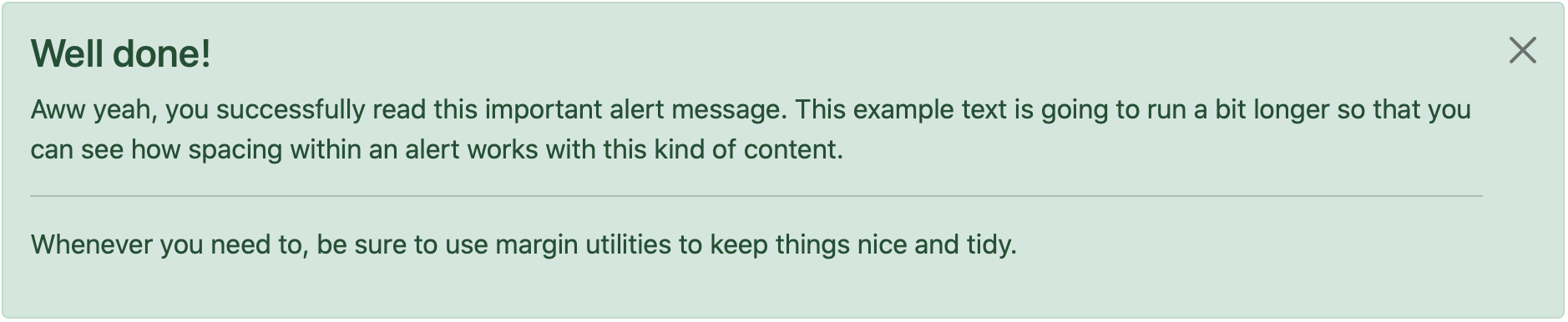
Alerts can be marked dismissible which implies that a close button is added on the right hand side.
Note
- New features:
Alerts can have shadows to optically lift them.
Also see Bootstrap 5 Alerts documentation.
Badge component#
Badges are small count and labeling components usually in headers and buttons.
While often useful if populated automatically as opposed to statically in a plugin, badges are useful, e.g., to mark featured or new headers.
Also see Bootstrap 5 Badge documentation.
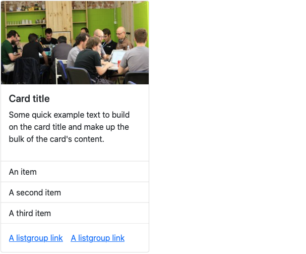
Card component#
A card is a flexible and extensible content container. It includes options for headers and footers, a wide variety of content, contextual background colors, and powerful display options.
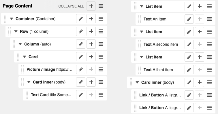
A card consists of the card wrapper itself, the Card Plugin. It can contain one ore more instances of a Card Inner Plugin for header, body or footer, but also potentially an Image Plugin for the card image or list group components.
The corresponding plugin tree is here:
Cards can be grouped by a Card Layout component offering the ability group cards or display a grid of cards. The latter can be controlled by responsive tools. If you need more granular responsive settings, please revert to Grid plugins and build your own custom grid.
Warning
djangocms-bootstrap4 Card Decks are not supported by Bootstrap 5. Card decks will be converted to grids of cards upon Migrating from djangocms-bootstrap4.
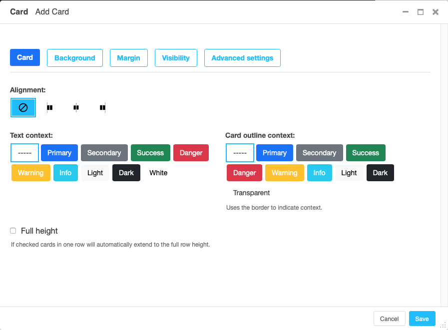
Card#
The card resides in a Card plugin which allows for coloring, opacity and shadow options.
Content is added to the card plugin by creating child plugins. These can be of the type Card inner, Picture / Image, List group, or Row.
Note
- New feature:
By adding images or list groups directly to a card, unnecessary margins are avoided.
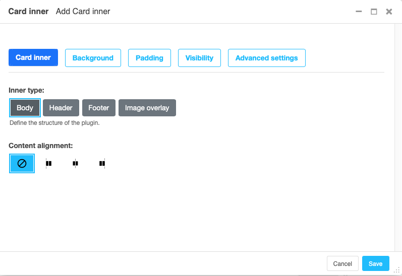
Card inner#
The Card Inner plugin allows to add the card header, body, footer or an overlay space for a card image.
Here is an example of the new card Image overlay feature:

Also see Bootstrap 5 Card documentation.
Carousel component#
A Carousel is a set of images (potentially with some description) that slide in (or fade in) one after the other after a certain amount of time.
Collapse component#
The Collapse hides text behind its headline and offers the user a trigger (e.g., a button) to reveal itself.
Compared to the accordion component the collapse component often is more flexible but also requires more detailed styling.
Jumbotron component#
The jumbotron component is a large header, used e.g. as a page header. It has been part of Bootstrap 4 and is still supported as a convenient way to generate page headers.
Note
The jumbotron header is not reflected by the table of contents component.
List group component#
List groups are a flexible and powerful component for displaying a series of content. Modify and extend them to support just about any content within.
The component consists of a wrapper - ListGroup Plugin - and the items of the list - ListGroupItem Plugin. If the list item is a link it suffices to insert a Link Plugin directly as a child of the ListGroup Plugin.
List group#
The only setting is the list group flush setting. If checked, the list group will be rendered without borders to blend into the surrounding element, e.g. a card.
List group item#
Simple content can be specified by providing “One line content”. More complex content of a list group item is rendered by child plugins. If child plugins are available the “one line content” is ignored.
List group items can have a context (color), and three state: Regular, active and disabled.
Note
- New feature:
Links can be added to list groups and automatically are interpreted as list group items.
Media component#
The media component is another legacy component from djangocms-bootstrap4. djangocms-frontend recreates it using responsive utilities.
Picture / image component#
The image or picture component make responsive picture uploads available as well as responsive embedding of external pictures.
Spacing component#
The spacing component provides horizontal and/or vertical spacing. If used without child plugins it just provides the amount of space specified on the specified sides.
Note
If no spacing is selected the spacing component can be used to individually style the content using the attributes fields in “Advanced Settings”.
Blockquote component#
Creates a <blockquote> tag.
Note
- New feature:
Alternatively to the un-formatted quote text, child plugins can be used to fill the content of the blockquote.
Code component#
Have code snippets on your site using this plugin, either inline or as a code block.
Figure component#
The figure component supplies a wrapper and a caption for a figure. The figure itself is placed inside the figure component (as child plugins).
Tabs component#
Note
Bootstrap 5 comes with a fade animation. Additional animations will have to
be provided by you or a third party. If you use a CSS animation library,
you can make these animations available by adjusting the
DJANGOCMS_FRONTEND_TAB_EFFECTS setting.